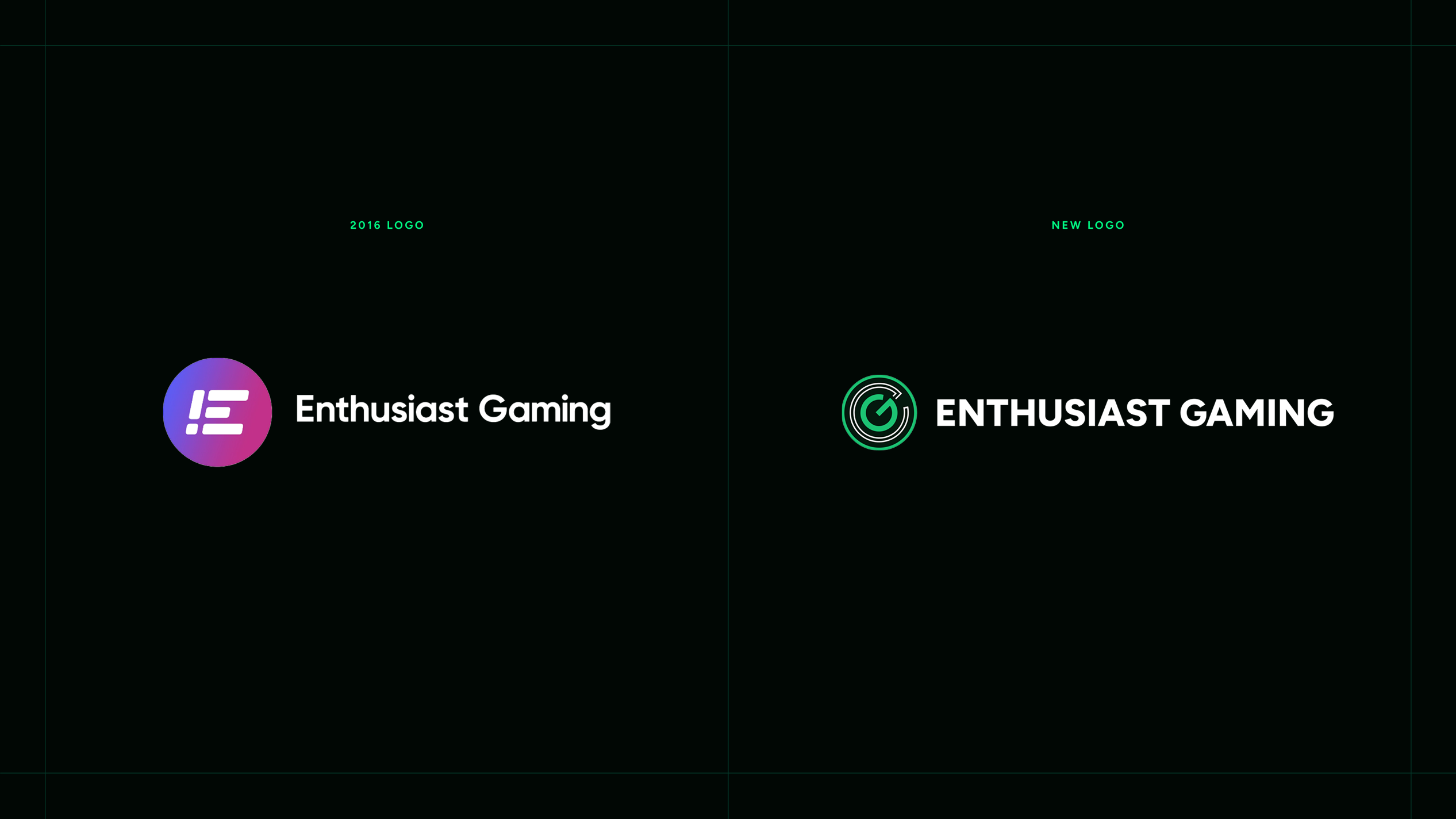
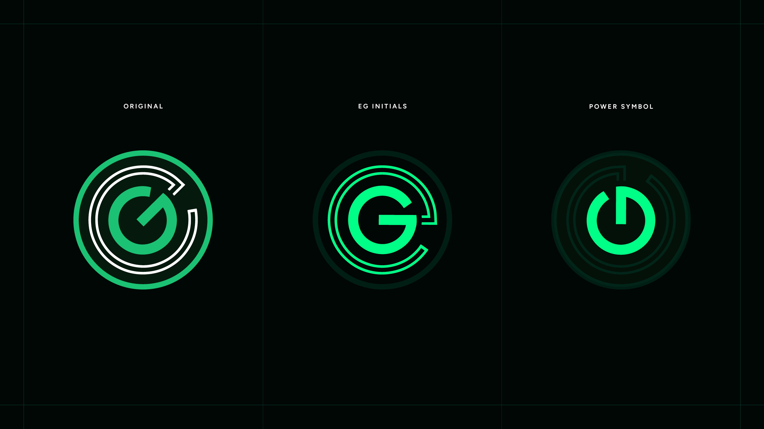
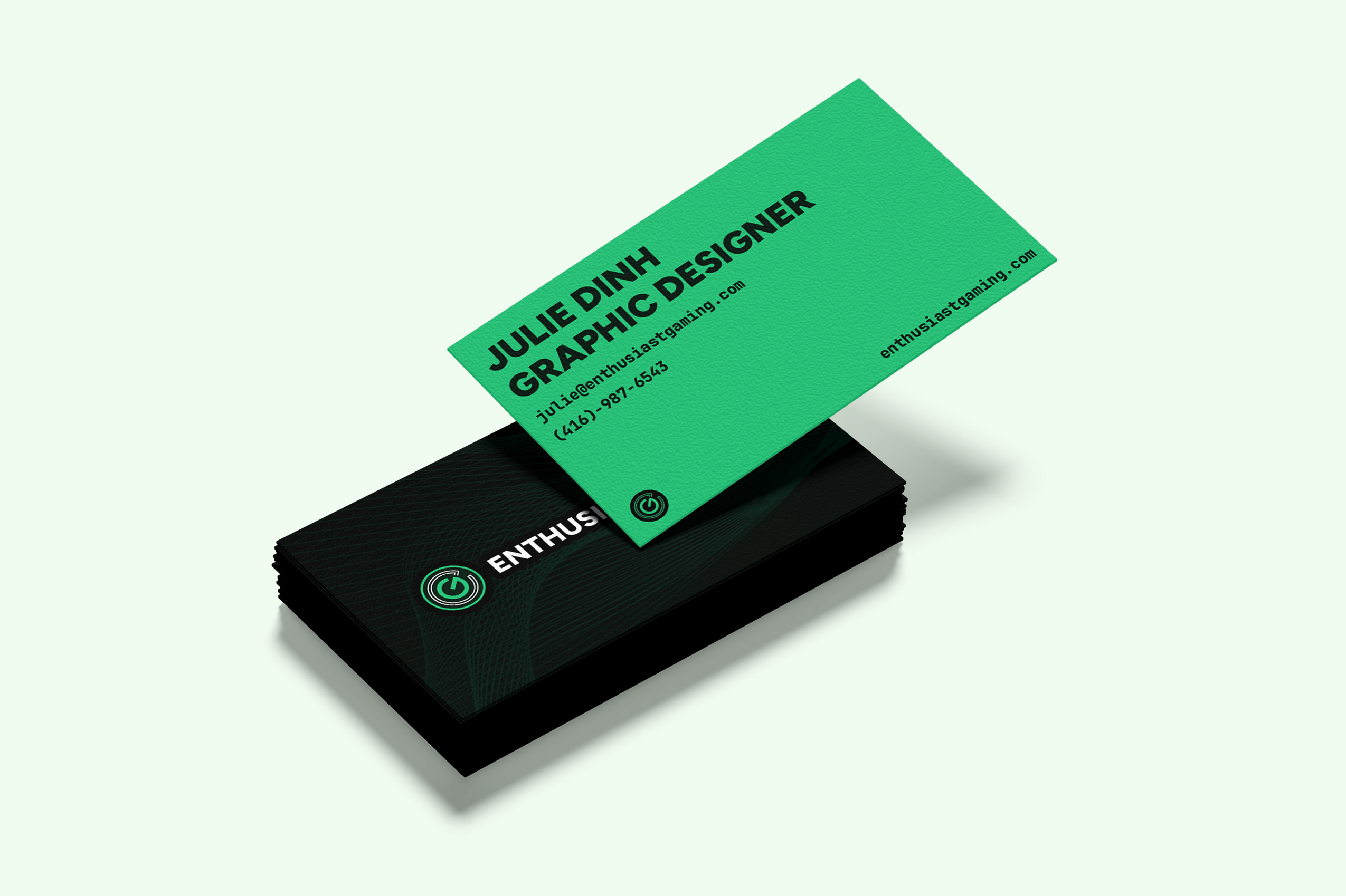
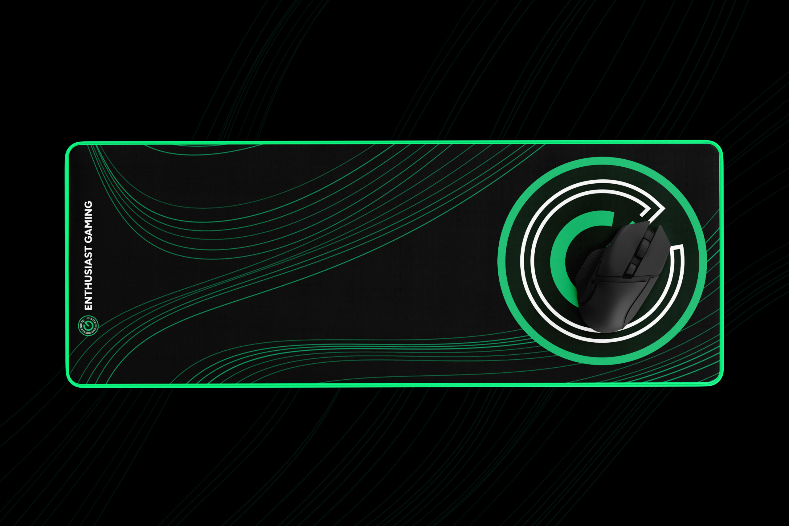
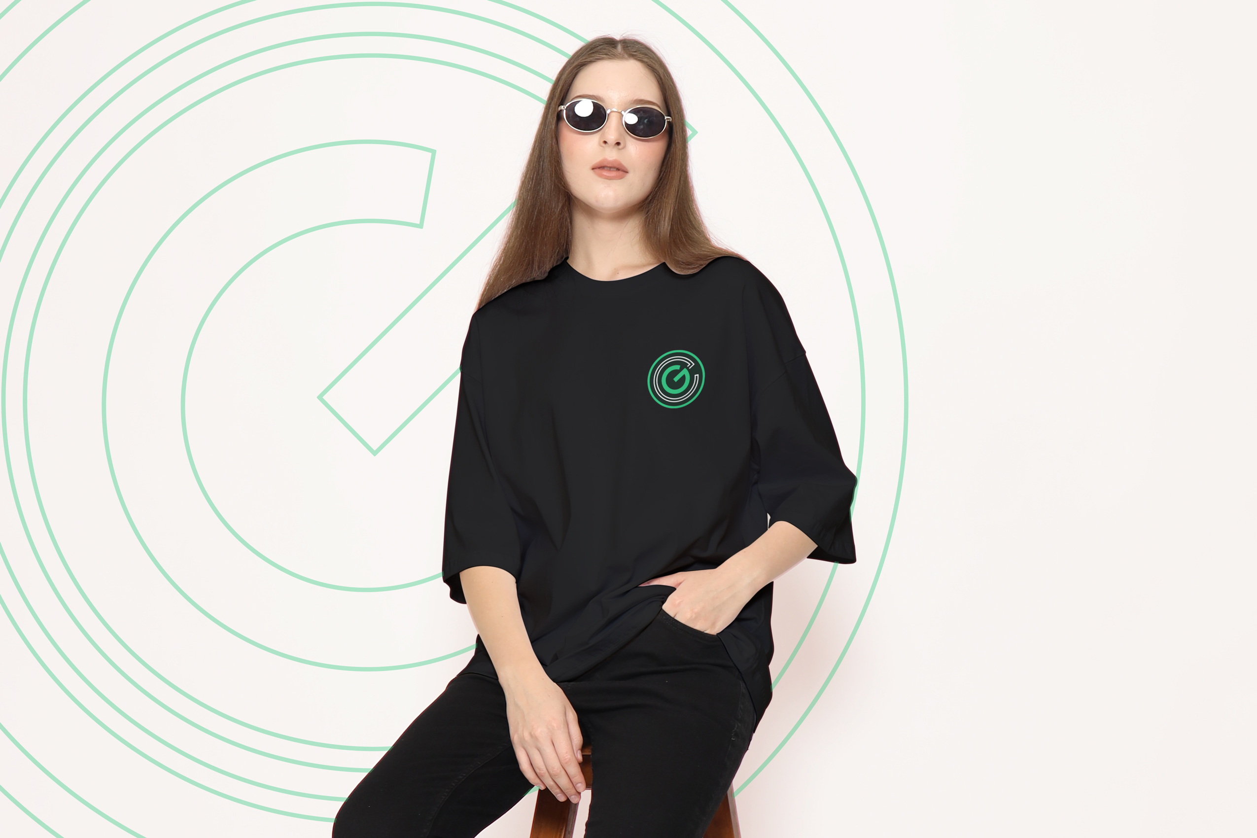
This brand refresh brings EG back to its roots by evolving the original logo into a more modern and refined expression. The mark seamlessly integrates the EG initials with a power symbol, reinforcing the brand’s gaming heritage and the idea of activation and readiness. A clean, sans-serif font enhances professionalism, improves readability, and ensures the logo remains clear, versatile, and adaptable across digital, print, and merchandise applications.
Client: Enthusiast Gaming Inc. Designer: Julie Dinh – This is the designers cut.